
Our Portfolio
Our Most Recent Projects
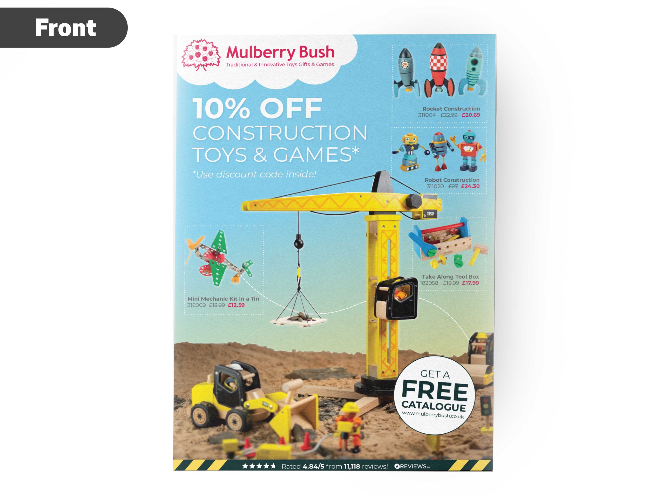
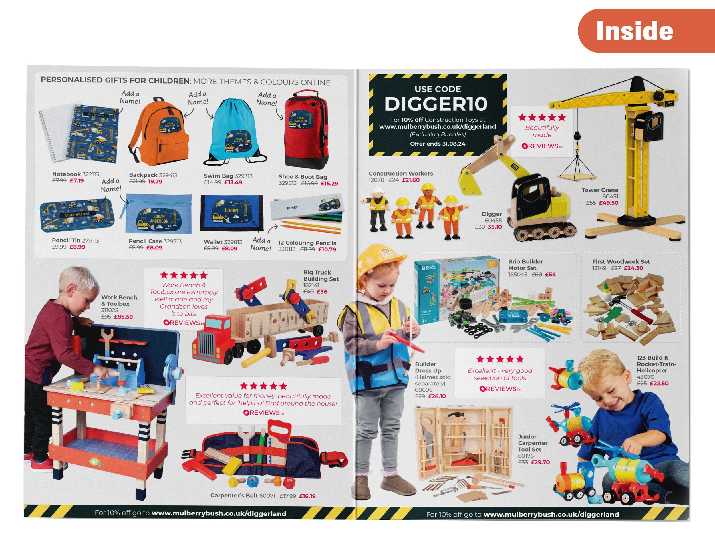
Mulberry Bush - Diggerland Leaflet
Drag the arrows to reveal the before & after
Mulberry Bush Ltd is an established mail order company, founded in 1996, specialising in traditional toys, gifts and games.
Our client was collaborating with Diggerland and wanted a leaflet to go in the soft play areas around their parks.
Click on the drop down below to see what our client requested to how we got the final result.
-
We would like a leaflet that:
Appeals to the Diggerland audience
Bright, colourful & eyecatching
Appeal to children of all ages
To include reviews for specific products
Include photos of children playing with the toys
Add our discount code
-
We are extremely happy with the final results. We decided to make the theme of the leaflet construction because all we know about the Diggerland audience is that they must love diggers!
We chose grey for the inside as its a neutral colour which wouldn't clash with the colours of the toys but made them pop instead.
We also added a fantastic mixture of toys for all ages as requested.
xxxxxxxxxxxxxxxxx xxxxxxxxxxx
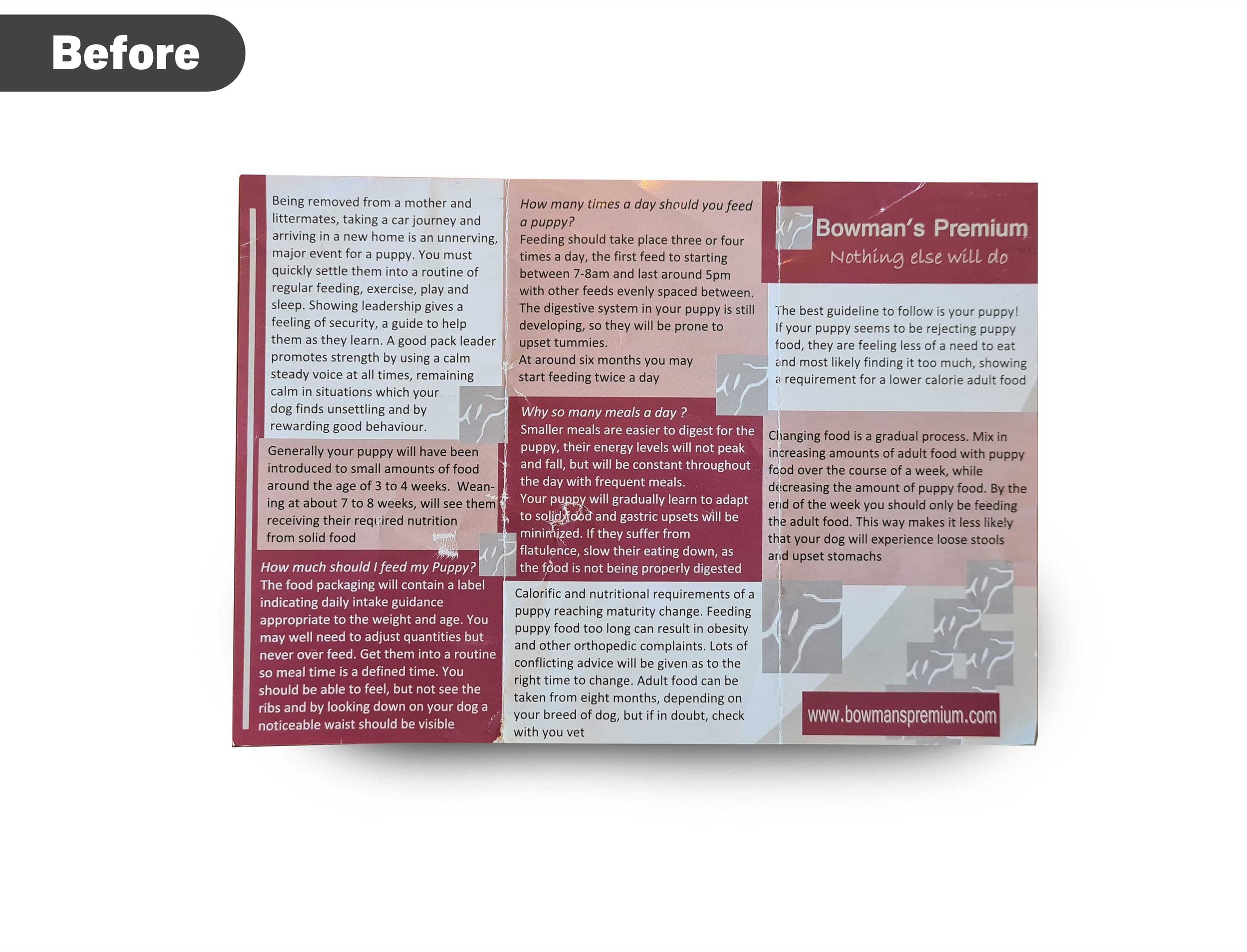
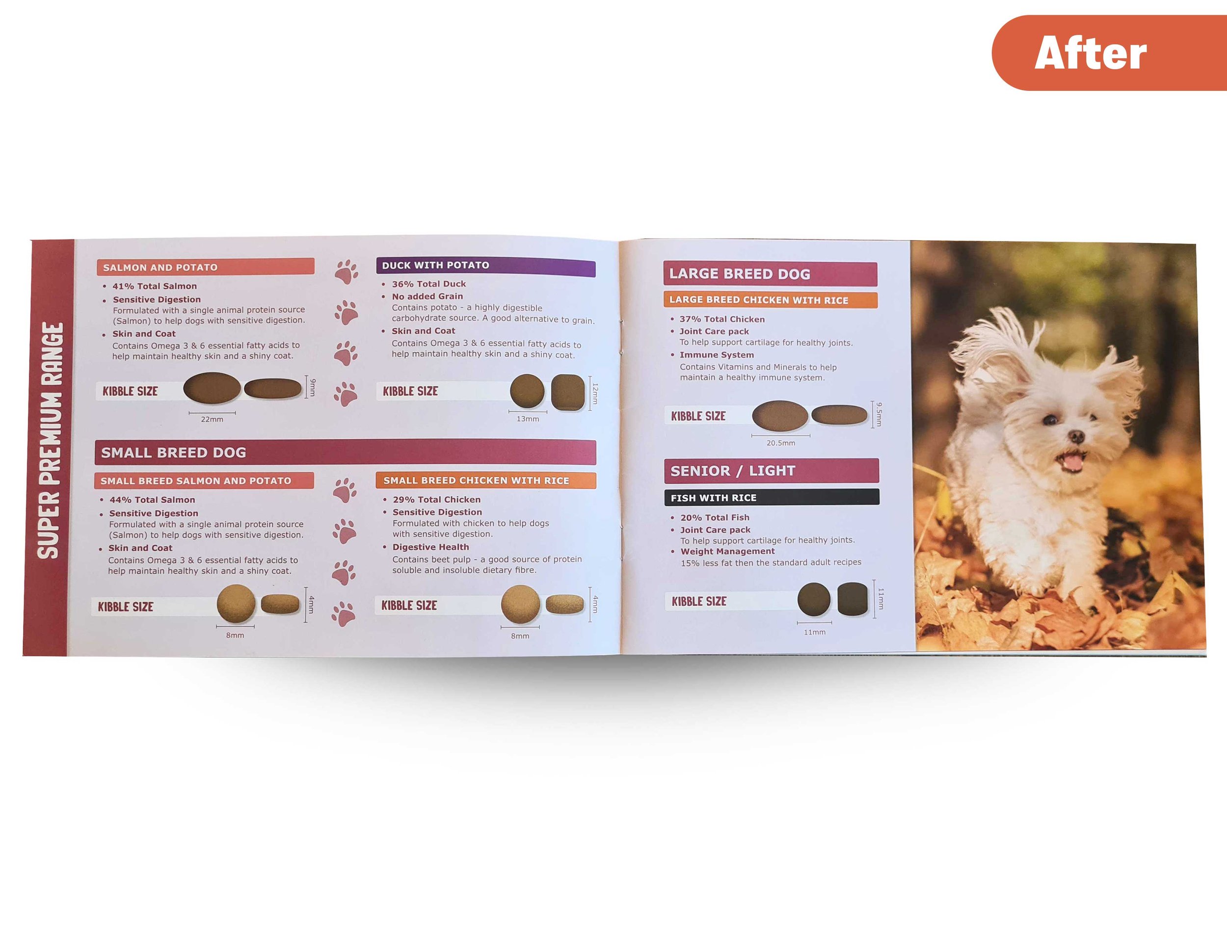
Bowman’s Premium is a family run small business in Saltdean, which specialises in premium dog food at affordable prices.
We were asked to create a brochure for them of all their delicious dog food flavours.
Click on the drop down below to see what our client requested to how we got the final result.
-
Please could you create us a brochure which includes:
All our dog food flavours for our super premium and grain free range.
Include the size of the kibble and what dogs it can be used for.
Add information about us and the benefits of our food.
Mention that our food is produced in the UK
-
Description text goes here
-
Description text goes here

Drag the arrows to reveal the before & after
xxxxxxxxxxxxxxxxxxxxxxxxx
Bowman’s Premium is a family run small business in Saltdean, which specialises in premium dog food at affordable prices.
We were asked to create a brochure for them of all their delicious dog food flavours.
Click on the drop down below to see what our client requested to how we got the final result.
-
Please could you create us a brochure which includes:
All our dog food flavours for our super premium and grain free range.
Include the size of the kibble and what dogs it can be used for.
Add information about us and the benefits of our food.
Mention that our food is produced in the UK
-
Description text goes here
-
Description text goes here

Drag the arrows to reveal the before & after
Mulberry Bush - Diggerland Leaflet
Drag the arrows to reveal the before & after
-
Mulberry Bush Ltd is an established mail order company, founded in 1996, specialising in traditional toys, gifts and games.
Our client was collaborating with Diggerland and wanted a leaflet to go in the soft play areas around their parks.
Click on the drop down below to see what our client requested to how we got the final result.
-
We would like a leaflet that:
Appeals to the Diggerland audience
Bright, colourful & eyecatching
Appeal to children of all ages
To include reviews for specific products
Include photos of children playing with the toys
Add our discount code
-
We are extremely happy with the final results. We decided to make the theme of the leaflet construction because all we know about the Diggerland audience is that they must love diggers!
We chose grey for the inside as its a neutral colour which wouldn't clash with the colours of the toys but made them pop instead.
We also added a fantastic mixture of toys for all ages as requested.
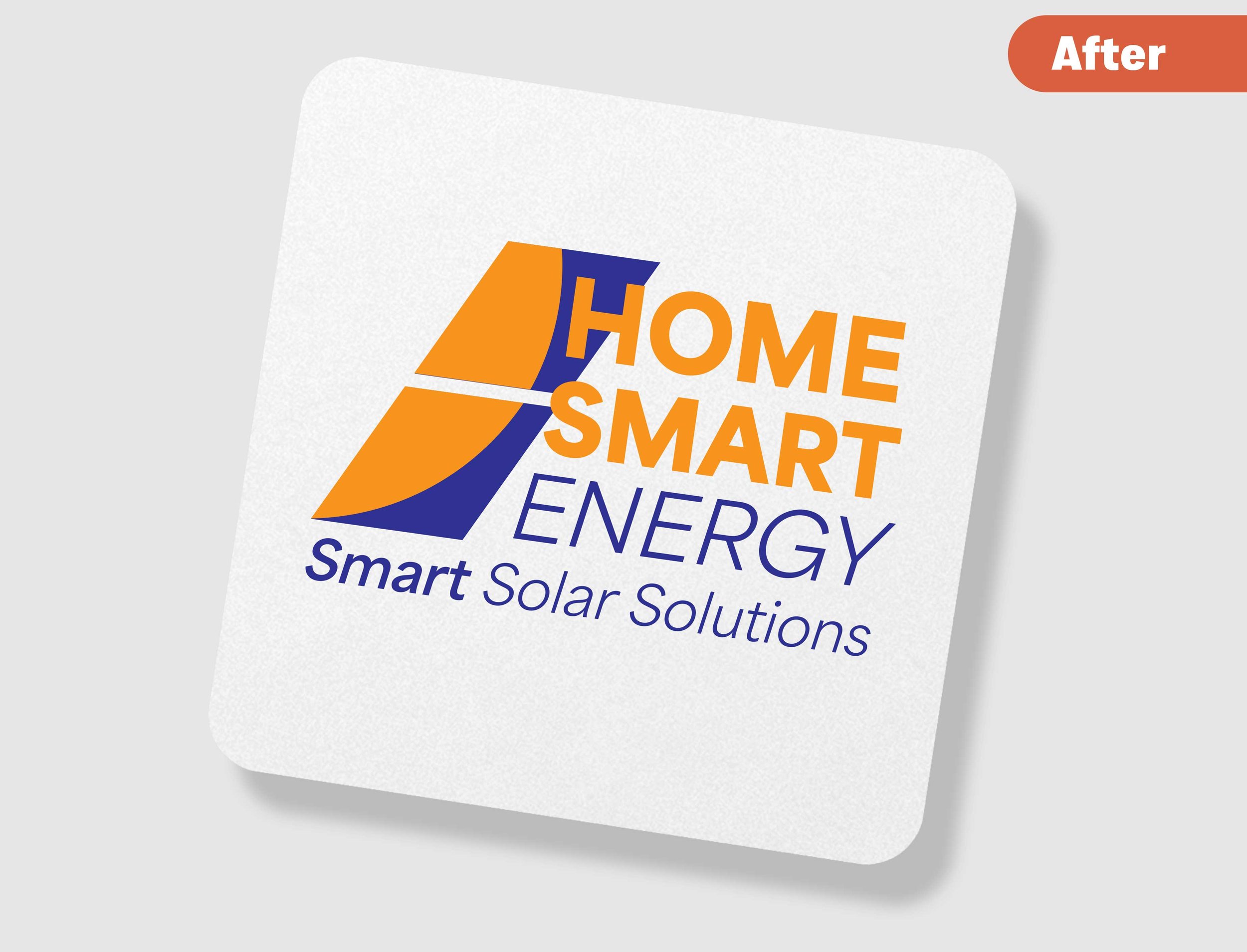
Home Smart Energy - Logo Design
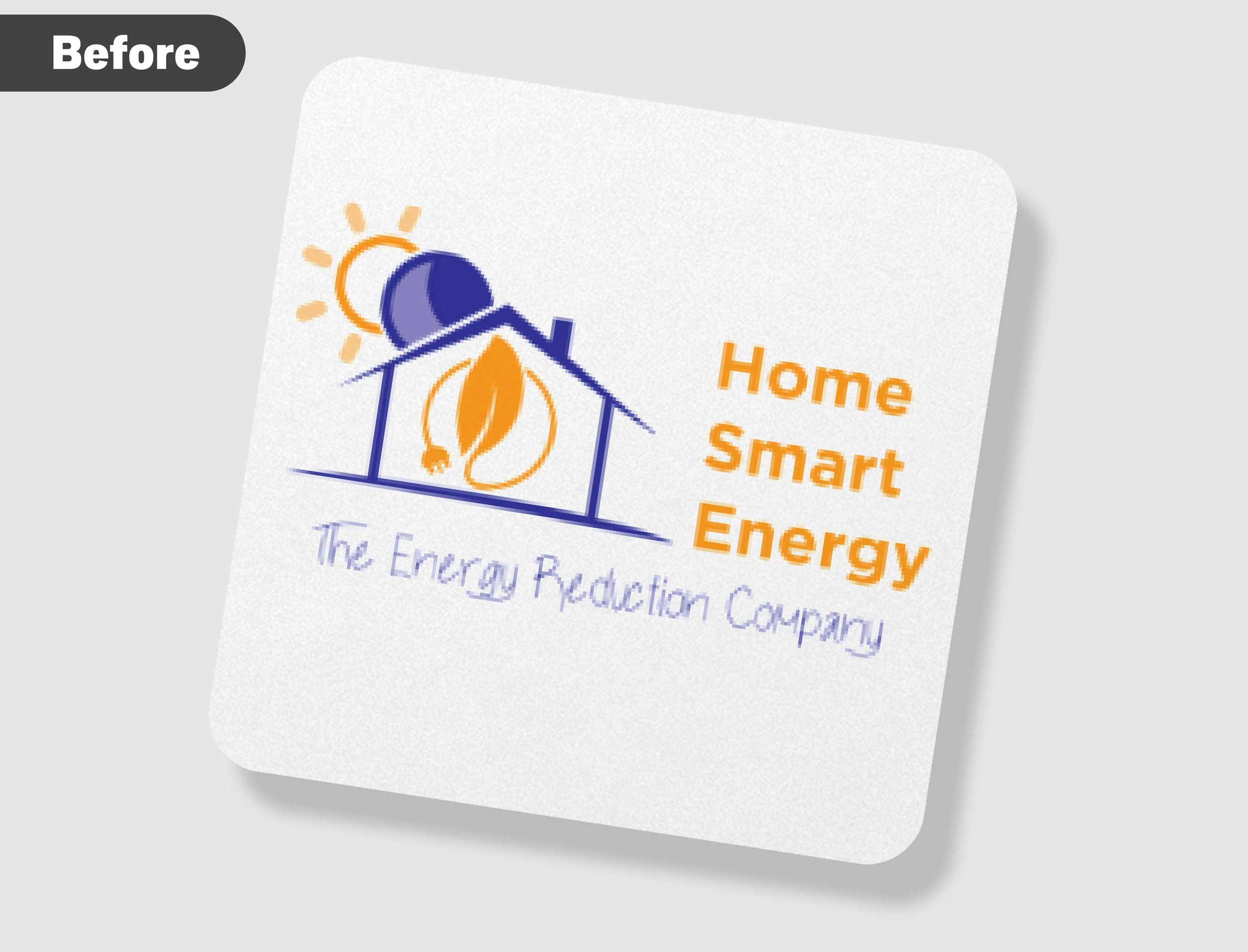
Home Smart Energy supply solar solutions to homes across the UK.
They have had the same logo for many many years and were looking to modernise it to represent the company they are today.
Click on the drop down below to see what our client requested to how we got the final result.
-
Things that we dislike about the existing logo:
It looks dated
The fonts don’t match (and aren’t nice fonts anyway)
Slogan makes us sound like an energy company, not a renewable energy installer
Doesn’t represent the work we do or the industry we’re in
It’s quite a ‘boring’ and basic logo, not much life to it
It’s not very suited to resizing, i.e., it’s not a very transferable logo that can be used for small and large applications
Things we like about the existing logo:Colours used; we’d like to keep the orange and deep blue/purple that we’re currently using (greens and light blues are too typical within the solar industry)
What we want our new logo to do:
Be more modern
Represent the industry
Have an aesthetically pleasing, standardised font
Be transferable to both small and large scales i.e., business cards and also large-scale signs
Incorporate a new slogan, an early idea is something like “Helping your energy stay smart” but we’re open for this to be changed as we go through the consultation process.
-
Our goal was to update the logo without making it look the same as every other solar panel company with typical icons used for clean energy. We love the final result and this is how we did it:
First we chose a sleek modern font, which could be used for more then one purpose such as the website, signs etc.
We kept the colours of the previous logo.
We added 2 slanted squares to represent the solar panels, while including an orange half circle inside to represent the sun shining on them.
Then finally we added the new tagline underneath which squared off the logo nicely.
We also supply all our customers with logo variations to use in different places. Click on view all projects to see how the logo was used.
Drag the arrows to reveal the before & after
Home Smart Energy - Logo Design
Drag the arrows to reveal the before & after
-
Home Smart Energy supply solar solutions to homes across the UK.
They have had the same logo for many many years and were looking to modernise it to represent the company they are today.
Click on the drop down below to see what our client requested to how we got the final result.
-
Things that we dislike about the existing logo:
It looks dated
The fonts don’t match (and aren’t nice fonts anyway)
Slogan makes us sound like an energy company, not a renewable energy installer
Doesn’t represent the work we do or the industry we’re in
It’s quite a ‘boring’ and basic logo, not much life to it
It’s not very suited to resizing, i.e., it’s not a very transferable logo that can be used for small and large applications
Things we like about the existing logo:Colours used; we’d like to keep the orange and deep blue/purple that we’re currently using (greens and light blues are too typical within the solar industry)
What we want our new logo to do:
Be more modern
Represent the industry
Have an aesthetically pleasing, standardised font
Be transferable to both small and large scales i.e., business cards and also large-scale signs
Incorporate a new slogan, an early idea is something like “Helping your energy stay smart” but we’re open for this to be changed as we go through the consultation process.
-
Our goal was to update the logo without making it look the same as every other solar panel company with typical icons used for clean energy. We love the final result and this is how we did it:
First we chose a sleek modern font, which could be used for more then one purpose such as the website, signs etc.
We kept the colours of the previous logo.
We added 2 slanted squares to represent the solar panels, while including an orange half circle inside to represent the sun shining on them.
Then finally we added the new tagline underneath which squared off the logo nicely.
We also supply all our customers with logo variations to use in different places. Click on view all projects to see how the logo was used.
Bowmans Premium - Leaflet Design
Bowman’s Premium is a family run small business in Saltdean, which specialises in premium dog food at affordable prices.
We were asked to create a brochure for them of all their delicious dog food flavours.
Click on the drop down below to see what our client requested to how we got the final result.
-
Please could you create us a brochure which includes:
All our dog food flavours for our super premium and grain free range.
Include the size of the kibble and what dogs it can be used for.
Add information about us and the benefits of our food.
Mention that our food is produced in the UK
-
Description text goes here
-
Description text goes here
Drag the arrows to reveal the before & after
Bowmans Premium - Leaflet Design
Drag the arrows to reveal the before & after
-
Bowman’s Premium is a family run small business in Saltdean, which specialises in premium dog food at affordable prices.
We were asked to create a brochure for them of all their delicious dog food flavours.
Click on the drop down below to see what our client requested to how we got the final result.
-
Please could you create us a brochure which includes:
All our dog food flavours for our super premium and grain free range.
Include the size of the kibble and what dogs it can be used for.
Add information about us and the benefits of our food.
Mention that our food is produced in the UK
-
Description text goes here
-
Description text goes here